Data visualization with R - Part 1
This workshop will introduce a few simple yet powerful functions for visualizing data with the ggplot package.
Getting started
Like we’ve done in our previous workshop, let’s set up a place to store our data and working files. Somewhere in your computer’s directory (it could be your Desktop or Documents folder, for example) create a new folder and give it a name (for example: data_journalism_with_r).
After starting RStudio, click “File” > “New File” > “R Script” in the menu to start a new script. Then go ahead and “Save As…” to give it a name.
Add a comment so we know what our script does.
#R script for the Duke Data Journalism Lab
#workshop on Jan. 28, 2022 on data viz
Set our working directory where we’ll store all our downloaded file.
#set working directory to the data folder of the downloaded repository
setwd("~/Desktop/data_journalism_with_r")
Execute the code by clicking “Run” or with CMD + Enter.
We should have most of our packages already installed, but we’ll use a few more in this walkthrough.
#install other packages
install.packages('zoo') #handy set of functions for advanced calculations
install.packages('geofacet') #neat tools for visualization
Load our Tidyverse package and any others.
#load our packages from our library into our workspace
library(tidyverse)
library(knitr)
library(zoo)
library(geofacet)
Downloading the data
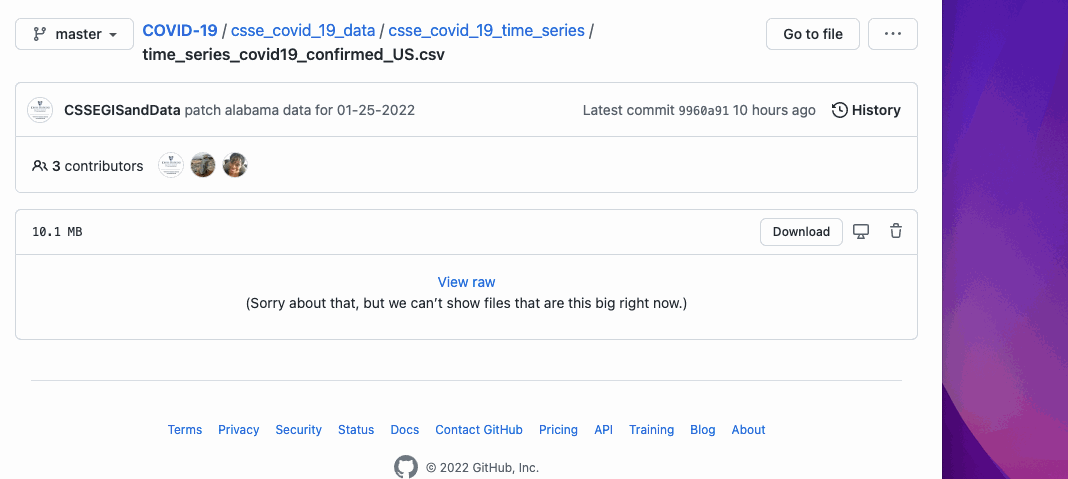
The data we’ll be working with today comes from Johns Hopkins University’s COVID-19 dataset, which has become a go-to source of data on the spread of the virus.
Specifically, we’ll be using time-series data on case counts by county, which the research group publishes as a comma-separated value file via its GitHub page.
Right click on the “Download” button to and click “Save Link As…”, then save the file to your chosen working directory. To simplify the filename, we’re going to save it as jhu_covid.csv.
Once our file is saved, we’ll load it in into a new dataframe called covid_time_series with a function from our Tidyverse package.
#load in our jhu covid data
covid_time_series <- read_csv('jhu_covid.csv')
Take note that in your “Environment” window (by default in the top right), you should be able to see your covid_time_series dataframe with more than 3,000 rows and hundreds of variables.
You can open the dataframe by clicking on its name in the “Environment” pane.
What do you notice about the shape of the data – in other words, the columns and rows? How do you expect it to change from day to day?
Basic gut checks
Before we start working with our data in earnest, let’s get to know our data a little bit.
We can see a number of columns that are pretty self explanatory. Some less so. We’ll need to explore those as we go. Navigate back to your script pane, and let’s do a few things to make sure our head is on straight.
For this section, we’ll be using the Tidyverse “pipe,” which looks like this %>% to chain together operations on our data.
We can see there’s a lot of data here. Let’s focus on North Carolina using the filter(), then the nrow() functions.
#count the number of rows for NC only
covid_time_series %>%
  filter(Province_State == 'North Carolina') %>% #filter for North Carolina
  nrow() #count the rows
That should return a value of 102.
But wait! There are only 100 counties in North Carolina.
So what’s going on? Let’s take a closer look.
#examine the county list for the NC data
#and put it in a nice table with kable
covid_time_series %>%
  filter(Province_State == 'North Carolina') %>% #filter for North Carolina
  select(Admin2) %>% #select allows us to return only specific columns
  kable('simple') #make it pretty
Looks like we’ve got two unexpected values: “Unassigned” and “Out of NC”, so we’ll need to make a note to filter those out in the future.
We can see that these numbers indicate positive COVID-19 cases by county, day by day. But what if we wanted the total for the whole state? Which column would want we to sum?
Let’s do that – quickly – and make sure this data roughly matches another source, just because we’re paranoid.
We’ll use the summarize() function to sum up the latest date column.
` symbol (called a backtick) here ⤵ instead of a single or double quote for our date column name? Backticks are used when you've got weird characters in your column names (in this case, a / symbol. It's a good reason why using clean column names is always a good idea!#count up the total number of cases for the last date
covid_time_series %>%
filter(Province_State == 'North Carolina') %>%
summarize(total = sum(`1/25/22`))
Does that match the latest data from the N.C. Department of Health and Human Services’ COVID-19 dashboard?
If not, why not?
Wide vs. long data
As you may have gathered from the “time series” element of this data, we probably want to take a look at change in COVID case counts over time. Let’s simplify things by looking at one specific county – Durham.
#create a durham only dataset and drop our unneeded columns
durham_covid <- covid_time_series %>%
  filter(Province_State == 'North Carolina' & Admin2 == 'Durham') %>%
  select(-UID, -iso2, -iso3, -code3, -Country_Region, -Lat, -Long_, -Combined_Key)
We’re going to use ggplot, a package that works in tandem with the Tidyverse, to do some of our charting and graphing.
But there’s a formatting problem here: This data is current “wide.” We need it to be “long” to conform to the formatting rules of the ggplot library (and for general readability). We can also take this opportunity to format the dates correctly.
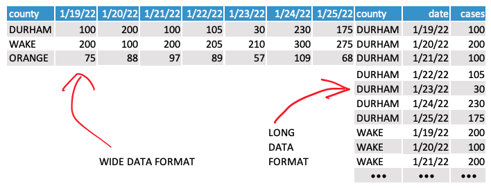
So we’ll need to do a little conversion with the pivot_longer() function, which basically just transposes the data based on a few parameters.
#reformat our data from wide to long
#by telling our function what columns we don't want split
#and clean up our date column
durham_covid_long <- durham_covid %>%
  pivot_longer(!c(FIPS, Admin2, Province_State), #do not transpose these columns
    names_to = 'date', #give our transposed data a column name
    values_to = 'case_count' #give our transposed values a column name
    ) %>%
  mutate(date = as.Date(date, format="%m/%d/%y")) #fix our date values by telling R what format to expect
Now, if you check the durham_covid dataframe, you’ll see our hundreds of columns transform into hundreds of rows!
Simple line charts
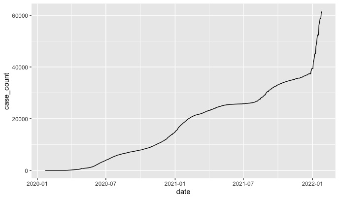
Using the ggplot package built right into Tidyverse, let’s generate a simple plot of cases over time in Durham. After this runs, you should see this in the “Plots” pane in the lower right-hand corner of your R Studio workspace.
+ symbol and the %>% symbol in the code below. ⤵ The ggplot package works by adding different elements to the plot vs. chaining the output of one function to the next, like the pipe operator does.#plot the case count over time
durham_covid_long %>%
ggplot(aes(date, case_count)) + #define the x and y axes
geom_line() #make a line chart
Cool! But also very ugly.
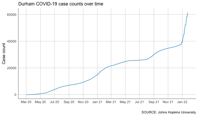
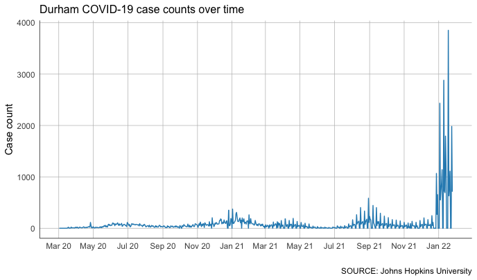
Let’s introduce a few styling elements to label and clean it up. We can also filter the data to eliminate all the wasted space at the start of the graph, when there were no COVID cases.
#make a prettier plot by adding in styling in ggplot
durham_covid_long %>%
  filter(date > '2020-03-01') %>% #only start charting after March 2020, when cases started
  ggplot(aes(date, case_count)) + #define the x and y axes
  geom_line(color = '#2b8cbe') + #make a line chart
  scale_x_date(date_breaks = '2 months', date_labels = "%b %y") + #specify a date interval
  labs(title = "Durham COVID-19 case counts over time", #label our axes
       caption = "SOURCE: Johns Hopkins University",
       x = "",
       y = "Case count") +
  theme(strip.text.x = element_text(size = 10), #do a little styling
        strip.background.x = element_blank(),
        axis.line.x = element_line(color="black", size = 0.25),
        axis.line.y = element_line(color="black", size = 0.25),
        panel.grid.major.x = element_line( color="grey", size = 0.25 ),
        panel.grid.major.y = element_line( color="grey", size = 0.25 ),
        axis.ticks = element_blank(),
        panel.background = element_blank(),
        plot.title = element_text(size = 12),
  )
That’s a little better!
Calculating rolling averages
We can certainly see some patterns in this data, but it’s a bit difficult. That’s because we know that the COVID-19 case counts grow over time – case counts don’t go down, they go up.
What we’re more interested in is how much that count grows over time. So we need to look at new cases more closely.
To do that, we’ll add a new column with the handy lag() function. This essentially allows us to “look back” at previous values in our rows and do some math with what we find.
In this case, we want to use mutate() to create a new column called new_cases, subtracting the case count one day ago from today’s case count.
#calculate new cases as a new column
durham_covid_new_cases <- durham_covid_long %>%
  mutate(new_cases = case_count - lag(case_count, 1)) #calculate new cases using current date and previous date's case count
Now let’s chart it again, substituting our new cases for our case count.
#chart new cases instead of cases overall
durham_covid_new_cases %>%
  filter(date > '2020-03-01') %>%
  ggplot(aes(date, new_cases)) + #swap in our new_cases variable for the y axis
  geom_line(color = '#2b8cbe') +
  scale_x_date(date_breaks = '2 months', date_labels = "%b %y") +
  labs(title = "New Durham COVID-19 cases over time", #tweak our chart title
       caption = "SOURCE: Johns Hopkins University",
       x = "",
       y = "Case count") +
  theme(strip.text.x = element_text(size = 10),
        strip.background.x = element_blank(),
        axis.line.x = element_line(color="black", size = 0.25),
        axis.line.y = element_line(color="black", size = 0.25),
        panel.grid.major.x = element_line( color="grey", size = 0.25 ),
        panel.grid.major.y = element_line( color="grey", size = 0.25 ),
        axis.ticks = element_blank(),
        panel.background = element_blank(),
        plot.title = element_text(size = 12),
  )
That’s… spiky. And even more complicated. Why might that be?
One way to smooth out the jitter is to take a rolling average.
For that, we’ll use a function from our zoo package to calculate that average over 7 days. It’s called rollmean() and it accepts a few parameters that tell it how we want to calculate our rolling window.
#calculate rolling average of new cases as a new column
durham_covid_rolling <- durham_covid_new_cases %>%
  mutate(rolling_new = round( #create a new variable and round it to a whole number
    rollmean(new_cases, #specify our variable
             7, #calculate over seven days
             fill = NA, #ignore if there are blank cells
             align = "right") #set the direction we want our rolling window to go.
    ))
With that column calculated, we can chart our case growth again – and see the trends much more clearly.
#chart the rolling average of cases instead of cases overall
durham_covid_rolling %>%
  filter(date > '2020-03-01') %>%
  ggplot(aes(date, rolling_new)) + #swap in our new rolling_new variable for the y axis
  geom_line(color = '#2b8cbe') +
  scale_x_date(date_breaks = '2 months', date_labels = "%b %y") +
  labs(title = "Rolling average of new Durham COVID-19 cases over time", #tweak our chart title
       caption = "SOURCE: Johns Hopkins University",
       x = "",
       y = "Case count") +
  theme(strip.text.x = element_text(size = 10),
        strip.background.x = element_blank(),
        axis.line.x = element_line(color="black", size = 0.25),
        axis.line.y = element_line(color="black", size = 0.25),
        panel.grid.major.x = element_line( color="grey", size = 0.25 ),
        panel.grid.major.y = element_line( color="grey", size = 0.25 ),
        axis.ticks = element_blank(),
        panel.background = element_blank(),
        plot.title = element_text(size = 12),
  )
Not bad at all!
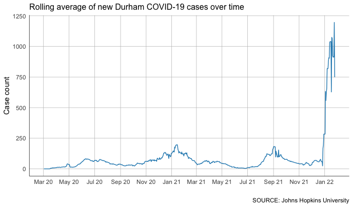
You can see some clear impacts of the recent surge in COVID-19 cases over the holidays. It’s so large, in fact, that it blows out most of the detail from the rest of the almost two years we’ve been tracking the virus.
There’s plenty more to explore here. For example: How might we tweak our code to focus specifically on the last two-month period?
Patterns in small multiples
What if we want to take a much broader look at countys other than just Durham? We can, and it’s easy!
We can use the same exact techniques and calculate these new columns for each of North Carolina’s 100 counties. We’ll start with a filtered, cleaned up set focusing on the whole state.
We’ll start with our original covid_time_series dataframe, which we smartly left intact. In the code below, we will:
- Filter for North Carolina
- Filter out those pesky rows that aren’t real counties
- Use the
select()function to leave out columns we don’t need - Use the
pivot_longer()function to convert our data from wide to long format - Fix the formatting on our dates.
! symbol we're using here ⤵ in our filter() function? It's one of the standard logical comparisons used across programming languages:
==equal to!=not equal to>greater than<less than>=greater than or equal to<=less than or equal to
#build out a covid dataset for North Carolina
nc_covid <- covid_time_series %>%
  filter(Province_State == 'North Carolina') %>%
  filter(Admin2 != 'Unassigned') %>%
  filter(Admin2 != 'Out of NC') %>%
  select(-UID, -iso2, -iso3, -code3, -Country_Region, -Lat, -Long_, -Combined_Key) %>%
  pivot_longer(!c(FIPS,Admin2,Province_State), names_to = 'date', values_to = 'case_count') %>%
  mutate(date = as.Date(date, format="%m/%d/%y"))
Just like we did before, let’s use our lag() and rollmean() functions. But first, we need to use the group_by() function to group by county. That way, our calculations are only conducted within the data for each county.
#calculate new cases and rolling average for each county
nc_covid_rolling <- nc_covid %>%
  group_by(Admin2) %>%
  mutate(new_cases = case_count - lag(case_count,1)) %>%
  mutate(rolling_new = round(rollmean(new_cases, 7, na.pad = TRUE, align="right")))
With that data, we can quickly build out individual charts for any county we want, like this.
#rolling average chart for different counties
nc_covid_rolling %>%
  filter(date > '2020-03-01') %>%
  filter(Admin2 == 'Mecklenburg') %>% #we'll specify the county in a filter here
  ggplot(aes(date, rolling_new))+
  geom_line(color = '#2b8cbe') +
  scale_x_date(date_breaks = '2 months', date_labels = "%b %y") +
  labs(title = "Rolling average of new Mecklenburg COVID-19 cases over time", #make sure to update our chart title
       caption = "SOURCE: Johns Hopkins University",
       x = "",
       y = "Case count") +
  theme(strip.text.x = element_text(size = 10),
        strip.background.x = element_blank(),
        axis.line.x = element_line(color="black", size = 0.25),
        axis.line.y = element_line(color="black", size = 0.25),
        panel.grid.major.x = element_line( color="grey", size = 0.25 ),
        panel.grid.major.y = element_line( color="grey", size = 0.25 ),
        axis.ticks = element_blank(),
        panel.background = element_blank(),
        plot.title = element_text(size = 12),
  )
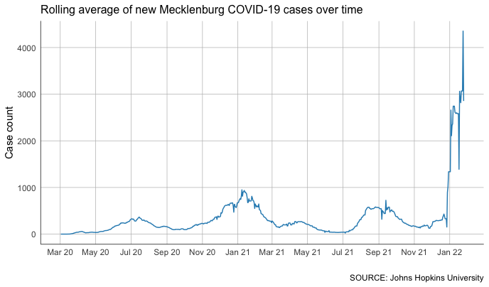
But that’s not much better than what we had for our Durham analysis above.
Let’s go further!
We can plot all of these counties on one chart. We can even use color to make them easier to differentiate on the plot.
#chart rolling average for all counties, colored by county
nc_covid_rolling %>%
  filter(date > '2020-03-01') %>%
  ggplot(aes(date, rolling_new, color=Admin2) ) + #no filter this time, but let's use color
  geom_line() +
  scale_x_date(date_breaks = '2 months', date_labels = "%b %y") +
  labs(title = "Rolling average of new COVID-19 case counts across all counties", #tweak our title
       caption = "SOURCE: Johns Hopkins University",
       x = "",
       y = "Case count") +
  theme(strip.text.x = element_text(size = 10),
        strip.background.x = element_blank(),
        axis.line.x = element_line(color="black", size = 0.25),
        axis.line.y = element_line(color="black", size = 0.25),
        panel.grid.major.x = element_line( color="grey", size = 0.25 ) ,
        panel.grid.major.y = element_line( color="grey", size = 0.25 ) ,
        axis.ticks = element_blank(),
        panel.background = element_blank(),
        plot.title = element_text(size = 12),
        legend.position = "none"
  )
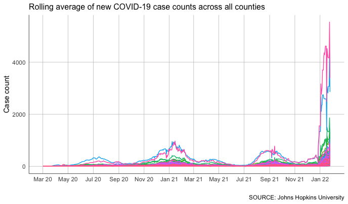
But that’s about as unhelpful as it is ugly.
Instead of looking at everything on the same plot, let’s use small multiples.
This approach splits the chart across many different, smaller charts. We’ll lose some precision, but it will be much, much easier to examine on a comparative basis (at least, theoretically).
The geofacet package has a great function called facet_geo() that can plot these small multiples. We can even choose from a long list of predefined grids that roughly translate to the geographic locations of features like counties, states or countries (you can even design and submit your own grid for inclusion in the library).
In this case, we’re going to use a predefined grid for North Carolina counties.
nc_covid_rolling %>%
  filter(date > '2020-03-01') %>%
  mutate(Admin2 = str_to_title(Admin2)) %>% #convert to title case for readability
  ggplot(aes(date, rolling_new) ) +
  geom_line(color = '#2b8cbe') +
  facet_geo(~Admin2, grid = "us_nc_counties_grid1") + #facet over a predefined NC grid we can
  scale_x_continuous(labels = NULL) + #specify we want a continuous (number) scale
  labs(title = "Rolling average of new cases in NC",
       caption = "SOURCE: Johns Hopkins University",
       x = NULL,
       y = NULL) +
  theme(strip.text.x = element_text(size = 6),
        strip.background.x = element_blank(),
        axis.ticks = element_blank(),
        axis.text = element_text(size = 6),
        panel.background = element_blank(),
        plot.title = element_text(size = 12),
  )
This should show up in your plot pane, but it’s probably worth pressing the “Zoom” button to pop the graphic out into a separate window so you can examine it a little better.
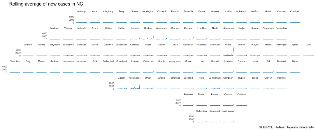
Pretty interesting.
But the reality is that the huge population difference between rural counties and others like Wake and Mecklenburg really blows up our scale.
So let’s introduce a variable axis that recales each chart based on its respective minimums and maximums.
There’s something of a tradeoff here: A variable axis can obscure big relative changes in small numbers. But we’re interested – at least in this stage – at understanding the shape of the curve, not necessarily its exact magnitude.
Because we want to keep that potential misinterpretation in mind, let’s remove the y-axis labels and focus on the curve alone.
#same thing, but with a variable axis
nc_covid_rolling %>%
  filter(date > '2020-03-01') %>%
  mutate(Admin2 = str_to_title(Admin2)) %>%
  ggplot(aes(date, rolling_new) ) +
  geom_line(color = '#2b8cbe') +
  facet_geo(~Admin2, grid = "us_nc_counties_grid1", scales="free_y") + #the free_y gives our charts a variable axis
  scale_x_continuous(labels = NULL) +
  labs(title = "Rolling average of new cases in NC",
       caption = "SOURCE: Johns Hopkins University",
       x = NULL,
       y = NULL) +
  theme(strip.text.x = element_text(size = 6),
        strip.background.x = element_blank(),
        axis.ticks = element_blank(),
        axis.text = element_text(size = 6),
        axis.text.y = element_blank(), #remove the y axis labels for space
        panel.background = element_blank(),
        plot.title = element_text(size = 12),
  )
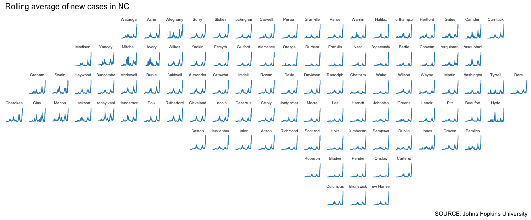
One thing we can tell: There was a record-breaking spike in every county, rural or not.
But now we have a new problem!
The winter 2022 spike is so high, it’s essentially blowing out all the other changes.
So maybe we focus on what’s happened lately by using a simple date filter.
Here, let’s start the plot on Nov. 26, the date the World Health Organization designated the new COVID-19 variant with the greek letter “omicron” – and declared it a “variant of concern.”
#move up the date filter
nc_covid_rolling %>%
  filter(date > '2021-11-26') %>%
  mutate(Admin2 = str_to_title(Admin2)) %>%
  ggplot(aes(date, rolling_new) ) +
  geom_line(color = '#2b8cbe') +
  facet_geo(~Admin2, grid = "us_nc_counties_grid1", scales="free_y") +
  scale_x_continuous(labels = NULL) +
  labs(title = "Rolling average of new cases in NC",
       caption = "SOURCE: Johns Hopkins University",
       x = NULL,
       y = NULL) +
  theme(strip.text.x = element_text(size = 6),
        strip.background.x = element_blank(),
        axis.ticks = element_blank(),
        axis.text = element_text(size = 6),
        axis.text.y = element_blank(),
        panel.background = element_blank(),
        plot.title = element_text(size = 12),
  )
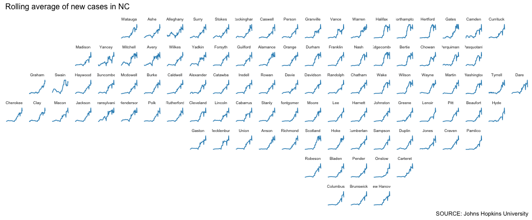
We still have a fidelity problem – this technique makes the magnitude hard to understand. But we can still observe things from the shape of the spike that might raise questions.
What do you notice?
Wrapping up
With just a few additional libraries, we’ve vastly expanded our ability to quickly clean and plot data on our hunt for patterns.
What questions can we ask of the data now? What patterns do you want to explore more closely? Which of these patterns raise questions we need to answer through additional reporting? These are good things to keep track of in your data diary.
Line charts aren’t all R can do with data visualization, but being able to create them adds a powerful tool to our arsenal.
In future workshops, we’ll leverage what we’ve learned so far – along with a few other features of ggplot – to explore relationships between variables. In particular: When is correlation also causation?