Mapping with R
This workshop expands on the functionality of the ggplot package even further, incorporating features on doing geospatial analysis. We’ll also look at a few other geographic information system (or GIS) tools for mapping that will come in handy for visualizing stories in data.
Getting started
Just like last time, let’s set up a place to store our data and working files.
Somewhere in your computer’s directory (it could be your Desktop or Documents folder, for example), create a new folder and give it a name (for example: data_journalism_with_r).
After starting RStudio, click “File” > “New File” > “R Script” in the menu to start a new script. Then go ahead and “Save As…” to give it a name.
Add a comment so we know what our script does. And set your working directory. We’ll also turn off scientific notation (more on this later).
#R script for the Duke Data Journalism Lab
#workshop on Feb. 11, 2022 on data viz

#set working directory to the data folder of the downloaded repository
setwd("~/Desktop/data_journalism_with_r")

#turn off scientific notation
options(scipen = 999)
Execute the code by clicking “Run” or with CMD + Enter.
We should have most of our packages already installed. But we will be using a new one called sf, or “simple features.”
#install other packages
install.packages('sf') #handy set of functions for geospatial analysis
Load our Tidyverse package and a few others.
#load our packages from our library into our workspace
library(tidyverse)
library(sf)
About the data
The data we’ll be working with today comes from the 2020 census, the once-in-a-decade count of every United States resident required by the Constitution.
Data for the 2020 census was published (late) in August 2021 for the purposes of redistricting, when state lawmakers redraw political lines for Congress and state legislatures across the country.
Before we load the data though, it’s helpful to understand a little more about it.
Because it’s intended specifically for political line-drawing, data from the 2020 redistricting data summary (P.L. 94-171) is a little more limited than you normally expect from the Census. It’s made up of tables counting the following topics:
- Race
- Race/ethnicity
- Race, 18 and up
- Race/ethncity, 18 and up
- Housing units (occupied or vacant)
- Group quarters (student housing, jails, etc.)
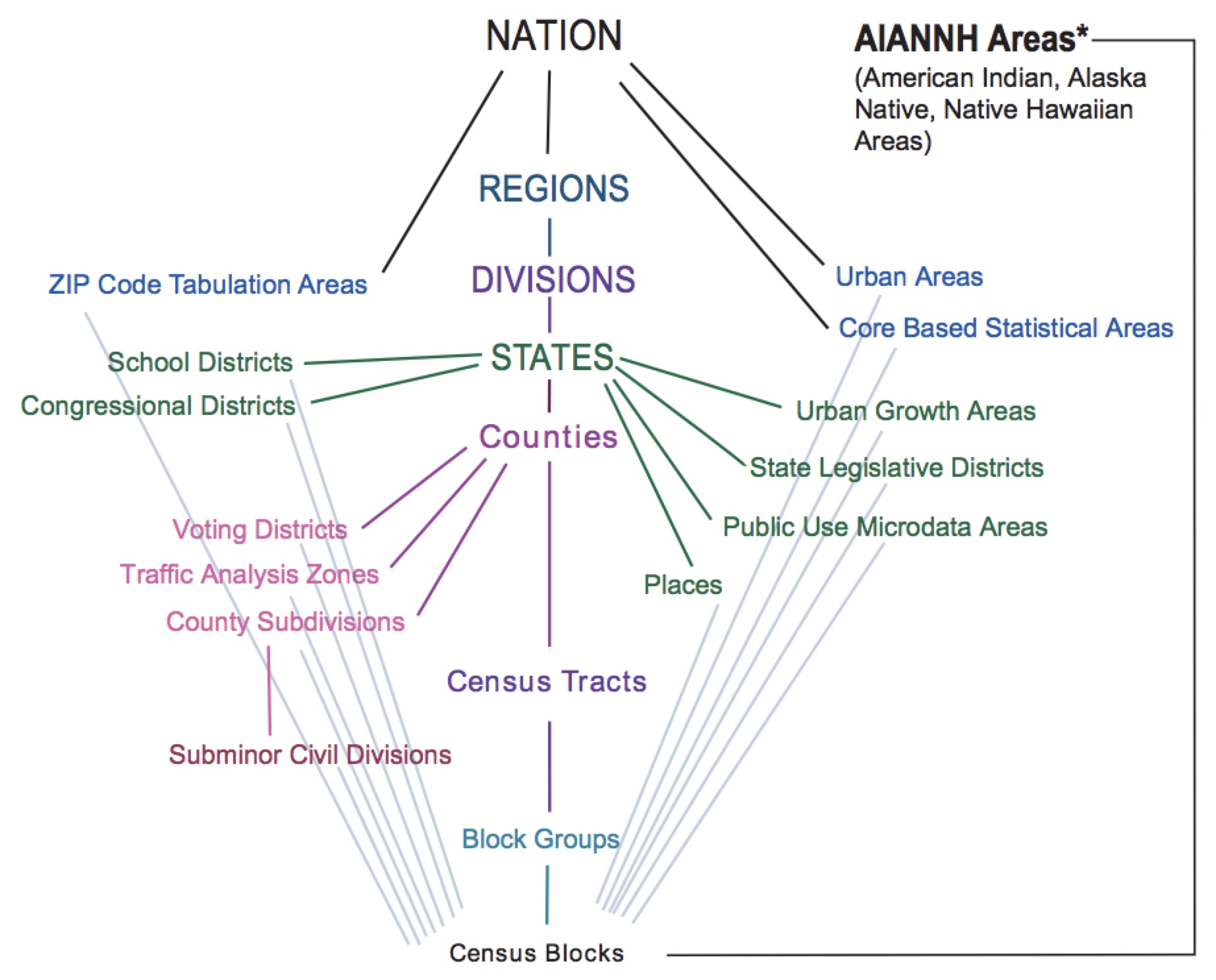
These counts are gathered on different summary levels (state, county, city) described by a summary level code.
| Area type | summary level code |
|---|---|
| State | 040 |
| County | 050 |
| Consolidated city | 170 |
| Place | 160 |
| Census tract | 140 |
| Block | 750 |
| Congressional district | 500 |
| NC Senate district | 610 |
| NC House district | 620 |
Every one of the geographies on each of these levels has a unique geographic identifier, or GEOIDS. The position of the number in every ID corresponds to a specific subdivision of a shape (think nesting dolls).
| 37 | 183 | 052404 | 1017 |
|---|---|---|---|
| State | County | Tract | Block |
More on that in a minute.
But there’s another thing we should know: Census geographies aren’t always stable over time.
Sure, state and counties are more or less the same decade to decade. But there are subtle shifts in other levels of geography – namely tracts and blocks – that mean you can’t just compare data from one decennial census to the next.
We’ll have to weight data from past years to make comparisons to the latest one. There are a few ways to do that, and the details are a bit outside the scope of this tutorial.
Just know that we’ll be using weighted data from 2010 – so don’t be surprised if you see some decimals when you might expect whole numbers!
And one last thing.
Census data itself doesn’t include any actual shapes. We’ll need to combine it with a separate set of shapefiles that function a little different than the data we’ve worked with so far. They’re called TIGER/Line files, and they use the same GEOIDs as our census data.
Loading the data
Download this zip file of datasets below by right clicking the link and selecting “Save link as…”
Save the file to your working directory and unzip it.
Inside, you’ll see a folder with several files:
- A CSV of weighted race and ethnicity by block for 2010
- A CSV of race and ethnicity by block for 2020
- A folder containing block-level shapefiles
We can load in our CSVs like we have before using the read_csv function.
#load in our race and ethnicity data for 2010 and 2020
race_eth2010 <- read_csv('nc_census_data/nc_blocks_2010_rc_eth_weighted.txt')
race_eth2020 <- read_csv('nc_census_data/nc_blocks_2020_rc_eth.txt')
Now we’ll load in our shapefile data, but that’s going to use the st_read function from our sf package to read in our shapefile. Don’t worry if it takes a minute to load – it’s a big file!
#load the block shapefile for nc
nc_blocks <- st_read('nc_census_data/nc_blocks/tl_2020_37_tabblock20.shp')
When it’s finished, the function will output a few things of interest, notably:
- The number of features or shapes
- The coordinates of the bounding box
- The coordinate reference system (or CRS) for the shapefile.
An aside on maps
“NAD83” stands for the North American Datum of 1983. It’s the system geographers used to translate an approximation of a globe into the latitude and longitude coordinates of this particular map.
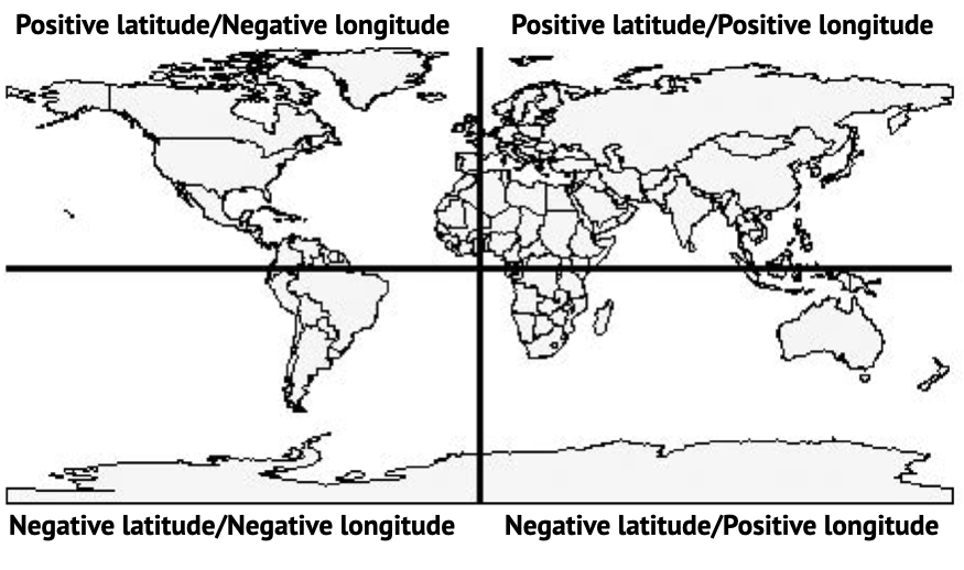
Because here’s the thing. It’s hard to know the shape of a sphere like this:

Which is actually more of an ellipsoid – it’s a little flattened on the top and bottom!
Other CRS systems (NAD27 or WGS84) do the same thing, but they can differ from each other by as much as 300 meters!
Just remember: latitude and longitudes aren’t absolute. So make sure if you’re using multiple shapefiles, their coordinate systems match.
If they don’t, it will cause problems with some of the “atomic units” of geography: your points, lines and polygons.
The shapefiles we’ll be working with are polygons that describe each of the 236,638 blocks in North Carolina.

Joining our data
You’ll notice that after you loaded in your shapefile data, the nc_blocks dataframe looks a lot like your other dataframes. You can even click on it and see that there is a good bit of data embedded there.
But there’s a column that looks a little weird – geometry – that is a little too complete to show in that traditional two-dimensional table.
Mapping 200,000+ blocks is a little resource intensive. You can do it, but it might take a while to render.
Instead, let’s just look at Durham County as a test using the FIPS code as a filter – that’s one of those GEOID levels we talked about earlier.
We’ll use a new function from ggplot called geom_sf() to add in our geometry instead of a line or a scatterplot.
#do a test map for durham county
nc_blocks %>%
  filter(COUNTYFP20 == '063') %>%
  ggplot() +
  geom_sf()
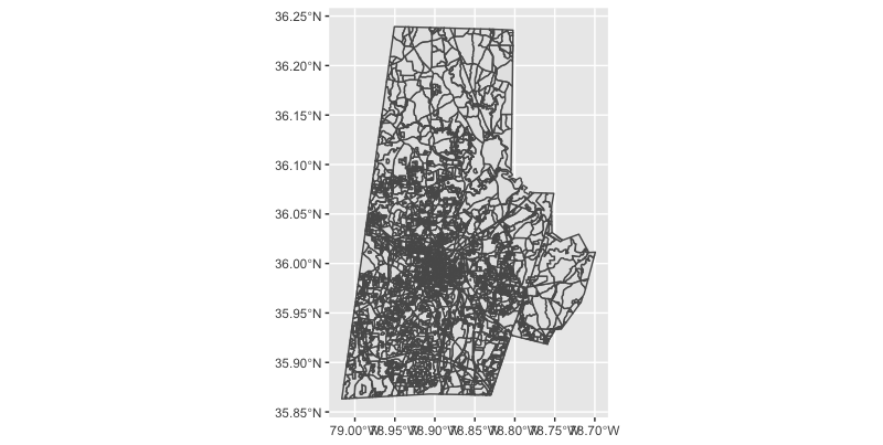
Beautiful it ain’t, but at least we know our geometry is working!
We can add in a few style elements to strip away the stuff we know we’re not interested in, like latitude coordinates and the background and add labels. We can also use a site like Colorbrewer to help us select nice palette.
#improve the syling a bit
nc_blocks %>%
  filter(COUNTYFP20 == '063') %>%
  ggplot() +
  geom_sf(fill = '#3182bd',
          size = 0.1,
          color = '#f0f0f0') + #add a color and a stroke width
  theme_void() + #add in a preset theme to simplify our map
  labs(caption = "SOURCE: U.S. Census Bureau",
       title = 'Durham County census blocks')
But there’s not a lot of data associated with the map yet. For that, we’ll need to join it up with our actual census data.
Let’s start with a few fields from the 2020 data, specifically, the ethnicity data. We’ll store the joined data into a new dataframe so we can work with it a little easier.
#join map data with our ethnicity data
nc_blocks_joined <- nc_blocks %>%
  left_join(
    race_eth2020 %>%
      mutate(geocode = as.character(geocode)) %>% #convert our match id to a character
      select(geocode, total, starts_with('eth_')), #subset our columns
    by = c('GEOID20' = 'geocode') #match the ids from the two tables
  )
Creating choropleth maps
Now that we’ve got some joined data, let’s make a choropleth map. “Choropleth” is Greek for “multitude of areas,” which makes sense here.
We want to show each of the blocks, color-coded by some aspect of our data.
Let’s start with something simple: a look at total population. We’ll add in scale_fill_distiller() to give us some control over the color scale of this variable, which is continuous (it goes from 0 to some whole number).
#map durham population
nc_blocks_joined %>%
  filter(COUNTYFP20 == '063') %>% #filter for durham
  ggplot() +
  geom_sf(aes(fill = total), #add aesthetic based on total population
          size = 0, #adjust the stroke
          ) +
  scale_fill_distiller(
    direction = 1 #change the direction of the scale
  ) +
  theme_void() + #add in a preset theme to simplify our map
  labs(caption = "SOURCE: U.S. Census Bureau",
       title = 'Durham County population by block',
       fill = 'Total population') #label our legend
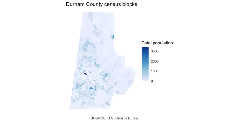
That’s… not great?
The blocks are so small (and there’s one particularly dense one), that it’s blowing up our scale and making any real trend pretty hard to see.
We could play around with normalizing the data a little bit by dividing the population into quartiles or quantiles. But we’re not actually all that interested in the count as much as some of the data within the count.
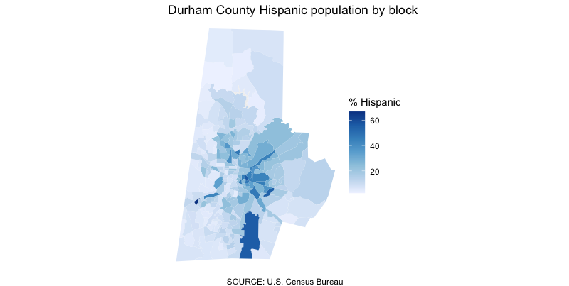
Let’s instead create a new column, calculating the percentage of Hispanic residents and map that instead.
#map durham's hispanic population
nc_blocks_joined %>%
  filter(COUNTYFP20 == '063') %>% #filter for durham
  mutate(hisp_pct = round(eth_hispanic/total * 100, 2)) %>% #calculate our new column
  ggplot() +
  geom_sf(aes(fill = hisp_pct), #add aesthetic based on total population
          size = 0, #adjust the stroke
  ) +
  scale_fill_distiller(
    direction = 1, #change the direction of the scale
    na.value = '#f0f0f0' #what to color the block when it's zero
  ) +
  theme_void() + #add in a preset theme to simplify our map
  labs(caption = "SOURCE: U.S. Census Bureau",
       title = 'Durham County Hispanic population by block',
       fill = '% Hispanic') #label our legend

That’s a little more illuminating! We can see concentrations of the Hispanic population in certain places with a little more fidelity, especially if we zoom in.
Know thy data
There’s something of a catch here, though.
For its 2020 census, the bureau introduced a new algorithm to create “noise” in the data to protect the privacy of those who answer. These privacy protections are required by law, and are especially important in places where the population is so small, you can basically reverse engineer the answers.
Because of this change in methodology, the U.S. Census Bureau encourages us to aggregate this data into larger groups so this “fuzziness” disappears.
We can construct our own block groups, of course, but a “block group” is an actual summary level in census data. We can redownload all the data on this level specifically. Or, as a proof of concept, we can aggregate those figures ourselves with the sf package.
A block group ID is the first 12 digits of our geographic identifier, so like we’ve done in the past, we can pair mutate() with substr() to create a new column that serves as our block group ID.
Then, we can group_by() and summarize(). We know how to do that already with things like totals and averages. But what about geometry?
We need to merge these grouped block ids together – turn multiple polygons into one. For that, we’ll use the st_union() function much in the same way we’ve used functions like sum() or mean(). Don’t forget to recalculate your Hispanic percentage so you can map it.
nc_blockgroups <- nc_blocks_joined %>%
  filter(COUNTYFP20 == '063') %>% #filter for durham
  mutate(block_group_id = substr(GEOID20, 1, 12)) %>% #create a block group id
  group_by(block_group_id) %>% #group by our new column
  summarize( total = sum(total), #add up the total population
             eth_hispanic = sum(eth_hispanic), #add up the hispanic population
             geometry = st_union(geometry) #merge our geometry
  ) %>%
  mutate(hisp_pct = round(eth_hispanic/total * 100, 2)) #calculate our new column
Then, we can plot that brand new, merged dataset just like we did before.
nc_blockgroups %>%
  ggplot() +
  geom_sf(aes(fill = hisp_pct), #an an aesthetic based on our total population column
          size = 0, #adjust the stroke
  ) +
  scale_fill_distiller(
    direction = 1, #change the direction of the scale
    na.value = '#f0f0f0' #what to color the block when it's zero
  ) +
  theme_void() + #add in a preset theme to simplify our map
  labs(caption = "SOURCE: U.S. Census Bureau",
       title = 'Durham County Hispanic population by block',
       fill = '% Hispanic') #label our legend
Wrapping up
There’s a lot more we can do here with just these tools.
Try combining what you’ve learned so far to explore:
- The distribution of other ethnic and racial groups
- The makeup of other counties
- Historical change from 2010 to 2020
What questions can we ask – and answer – with the data we have?