Data visualization with R - Part 2
This workshop picks up where our last data viz session left off, looking at even more functionality from the ggplot package. We’ll also some tips and tricks for exploring correlations between variables.
Getting started
Just like last time, let’s set up a place to store our data and working files.
Somewhere in your computer’s directory (it could be your Desktop or Documents folder, for example), create a new folder and give it a name (for example: data_journalism_with_r).
After starting RStudio, click “File” > “New File” > “R Script” in the menu to start a new script. Then go ahead and “Save As…” to give it a name.
Add a comment so we know what our script does. And set your working directory.
#R script for the Duke Data Journalism Lab
#workshop on Feb. 4, 2022 on data viz

#set working directory to the data folder of the downloaded repository
setwd("~/Desktop/data_journalism_with_r")
Execute the code by clicking “Run” or with CMD + Enter.
We should have most of our packages already installed.
Load our Tidyverse package and a few others.
#load our packages from our library into our workspace
library(tidyverse)
library(janitor)
Loading the data
For this exercise, we’re taking a look at COVID-19 vaccinations by census tract in North Carolina, a dataset mantained by the N.C. Department of Health and Human Services and last updated Dec. 14, 2022.
We’ll also examine voter registration data from the N.C. State Board of Elections, median household income data from the U.S. Census Bureau’s 5-year American Community Survey of 2019 and 2010 rural-urban classifications from the U.S. Department of Agriculture.
Download this zip file of datasets below by right clicking the link and selecting “Save link as…”
Save the file to your working directory and unzip it.
Inside, you’ll see a folder with several comma-separated value files, all on the tract level for North Carolina:
- Vaccination totals and rates
- Voter registration
- Median household income
- Rural-urban designations.
Once we save the files, we can use tidyverse to load them into dataframes.
We’ll use the clean_names() function from the janitor package on a few of them to quickly remove spaces and other potentially problematic characters from the column names.
#create a dataframe with our vax rates
vax_by_tract <- read_csv('nc_tract_data/vax_by_tract20211214.csv') %>%
  clean_names('snake') #standardize our column names

#create a dataframe for our voter registration file
voterreg_by_tract <- read_csv('nc_tract_data/registration_by_tract20210521.csv') %>%
  clean_names('snake') #standardize our column names

#create a dataframe with our median household incomes
income_by_tract <- read_csv('nc_tract_data/hhincome_by_tract2019acs.csv')

#and one more for our rural_urban classifications
ruca_by_tract <- read_csv('nc_tract_data/ruca_by_tract2010.csv')
Take note that in your “Environment” pane (by default in the top right), you should be able to see your dataframes with 2,195 rows – the exact number of 2010 census tracts for North Carolina.
Except for one! The voter registration table only has 2,176 rows. Why?
Basic gut checks
We can get to know our data with a few basic gut checks, and one is particularly easy: summary(). Give it a try on one of your dataframes to get a rundown of basic descriptive statistics.
#print a quick summary of variables for our vaccination data
vax_by_tract %>%
  summary()
Here’s a truncated version of that summary.
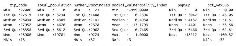
You can also look at a specific variable in your dataframe one at a time. You can also use the str() function to get a report on the types of data in each column – are they strings of alphanumeric characters, or integers, for example?
#just examine the population variable
summary(vax_by_tract$total_population)

#get a rundown of the types of data in each column
str(vax_by_tract)
It’s worth running this as an initial look, because you can spot a few things that may not make sense.
How is it possible, for example, for the maximum vaccination rate to be 160%? Why are more than 30 of the rows blank (or NA, in R parlance)?
Remember: data ≠ truth. It can help guide us in the direction of truth, but all data is gathered, and in some case estimated, by human systems that can introduce flaws.
As data journalists, it’s our responsibility to understand those flaws as best we can, and critically evaluate whether they’re significant enough to throw off our analysis.
We might, for example, want to see how many tracts have 100%+ vaccination rates, the sure sign of an error.
#check 100% and up vax rates among our tracts
vax_by_tract %>%
  filter(pct_vax5up > 100) %>% #only show me tracts with incorrect rates
  arrange(desc(pct_vax5up)) #sort in descending order
All told, that’s 6 of 2,195, or 0.3% of our total tracts.
We can probably live with that small of an error rate. But we need to be aware of it.
Formalizing our questions
When you first encounter a dataset (or several) there are two basic approaches to trying to turn it into a story.
- Generate questions through general exploration
- Ask a set of specific and discrete questions
We’re going to opt for the second approach, where we coming up with one or multiple hypotheses. Then we’ll test them – and see whether our hypothesis is supported or disproved by the evidence.
This is why data journalism (or precision journalism or computation journalism or computer-assisted reporting) is often called “social science on deadline.”
We want to borrow from that academic rigor and apply it to our problem.
What type of relationship do you think income has with vaccination rates? Partisanship? Urban-rural classification?
Think about that – and let that methodological approach guide your analysis.
Preparing the data
For now, our data exists in separate tables. But we want to match it all up so each row (or census tract) has all the information we’ll need to run our analysis.
We can do that with a few left joins. We can even chain them together with a few pipe characters (%>%)!
But what variable are we matching on?
Typically, the “match” variable is a unique ID for each dataset (duplicates will cause problems). And it’s important to remember that this ID has to be exactly equivalent to match – even by variable type.
So if you’ve got your ID imported as an integer in one dataset and a string in another, they won’t match up right.
As it happens, the ID we want to use to match up the datasets here is called something slightly different in each dataframe. But it’s describing the same geographic identififier assigned to each census tract.
The Census uses geographic identifiers, or GEOIDs, for each of its geographic shapes. The position of the number in every ID corresponds to a specific subdivision of a shape (think nesting dolls).
| 37 | 183 | 052404 | 1017 |
|---|---|---|---|
| State | County | Tract | Block |
We’re using data on the tract level, so we expect to have an 11-digit number to use in our joins.
Let’s use the str() function to check the variable type for these ID numbers in each table.
#get a rundown of the types of data in each column
str(vax_by_tract$fips)
str(ruca_by_tract$id)
str(income_by_tract$id)
str(voterreg_by_tract$tract_id)
What do you notice about these variable types?
For one, the id field in our income_by_tract table doesn’t look right. It’s a character string, for one, and it’s formatting totally different than the numbers in the other dataframes.
We actually want this variable to be a character in this case (it’s not really a number we’re going to do math on), so let’s do a little cleanup.
First, we’re going to transform the column into a character string for three of our tables. And while we’re at it, let’s standardize the column name and give our old id number the boot.
#convert id number to character string
vax_by_tract <- vax_by_tract %>%
  mutate(match_id = as.character(fips), #do the conversion
         .before=everything() #move the new variable to the beginning
         ) %>%
  select(-fips) #remove the old id column
ruca_by_tract <- ruca_by_tract %>%
  mutate(match_id = as.character(id), #do the conversion
         .before=everything() #move the new variable to the beginning
  ) %>%
  select(-id) #remove the old id column
voterreg_by_tract <- voterreg_by_tract %>%
  mutate(match_id = as.character(tract_id), #do the conversion
         .before=everything() #move the new variable to the beginning
  ) %>%
  select(-tract_id) #remove the old id column
Second, let’s clean up that mismatched column in our income_by_tract table.
The data we need is there, but it’s preceeded by several characters we don’t need. So we’ll use the substr() function to clean it up.
This function takes a slice of a character string depending on the position you want to cut up. In this case, we’ll start at the 10th position.
#trim our match id from the income table
income_by_tract <- income_by_tract %>%
  mutate(match_id = substr(id, 10, length(id)), #slice up the string starting at the 10th position to the end
         .before = everything()  #move the new variable to the beginning
         ) %>%
  select(-id) #remove the old id column
Now our data should be ready to match. So let’s match it.
With a left join, it’s a good habit to start with your most important dataframe first. For us, that’s our vaccination rate table, vax_by_tract.
#join all four tables together with the match_id
vax_main <- vax_by_tract %>%
  left_join(
    income_by_tract, by = 'match_id'
  ) %>%
  left_join(
    ruca_by_tract, by = 'match_id'
  ) %>%
  left_join(
    voterreg_by_tract, by = 'match_id'
  )
And there we go!
Simple scatterplots
Just like with our line charts, we’ll use ggplot to chart our data.
We’ll start small – with a very ugly map – we can tweak as we go.
#let's make an ugly map
vax_main %>%
  ggplot(aes(x = median_hh_income, y = pct_vax5up)) + #specify your x and y variables
  geom_point() #add a scatterplot
You might get a warning about missing data (remember our NA values from earlier?), but you should otherwise see something like this:
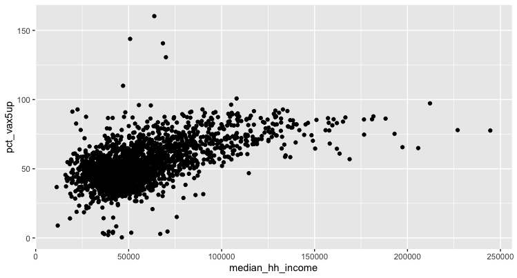
It looks like there may be some sort of relationship between income and vaccination. But we need to refine this a bit to suss out the specifics.
Let’s add some styling and prettify our plot.
#minor tweaks to our style to make the graph a little easier to read
vax_main %>%
  ggplot(aes(x = median_hh_income/1000, #simplify our labels
             y = pct_vax5up)
         ) +
  geom_point(
    color = '#3182bd', #color our points
    alpha = 0.5 #add a transparency to make them easier to see
  ) +
  theme_minimal() + #use a predefined theme
  ylim(0, 100) + #limit our y axis to throw out our outliers
  ggtitle('Income vs. vaccination rates in NC // December 2021') + #add a title
  theme(strip.text.x = element_text(size = 10), #tweak the style of text and gridlines
        axis.text = element_text(size = 8),
        axis.title = element_text(size = 10),
        panel.grid.major.x = element_line( color="grey", size = 0.25 ),
        panel.grid.major.y = element_line( color="grey", size = 0.25 )
  ) +
  xlab('Median income (thousands of dollars)') + #label the x axis
  ylab('% fully vaccinated') #label the y axis
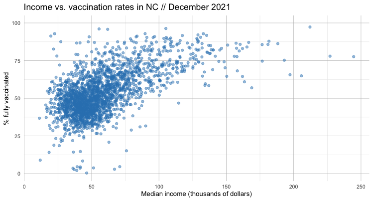
If we squint, we can sort of see a pattern in this data. It leads us to something of a hypothesis: the higher the income, the higher the vaccination rate.
Now let’s visualize that relationship by adding a regression line with geom_smooth().
#minor tweaks to our style to make the graph a little easier to read
vax_main %>%
  ggplot(aes(x = median_hh_income/1000, #simplify our labels
             y = pct_vax5up)
         ) +
  geom_point(
    color = '#3182bd', #color our points
    alpha = 0.5 #add a transparency to make them easier to see
  ) +
  theme_minimal() + #use a predefined theme
  ylim(0, 100) + #limit our y axis to throw out our outliers
  ggtitle('Income vs. vaccination rates in NC // December 2021') + #add a title
  theme(strip.text.x = element_text(size = 10), #tweak the style of text and gridlines
        axis.text = element_text(size = 8),
        axis.title = element_text(size = 10),
        panel.grid.major.x = element_line( color="grey", size = 0.25 ),
        panel.grid.major.y = element_line( color="grey", size = 0.25 )
  ) +
  xlab('Median income (thousands of dollars)') + #label the x axis
  ylab('% fully vaccinated') + #label the y axis
  geom_smooth(method = "lm", formula = y ~ x) #plot a regresion using a linear model
The only real difference is a new regression line – along with a visualization of the error.
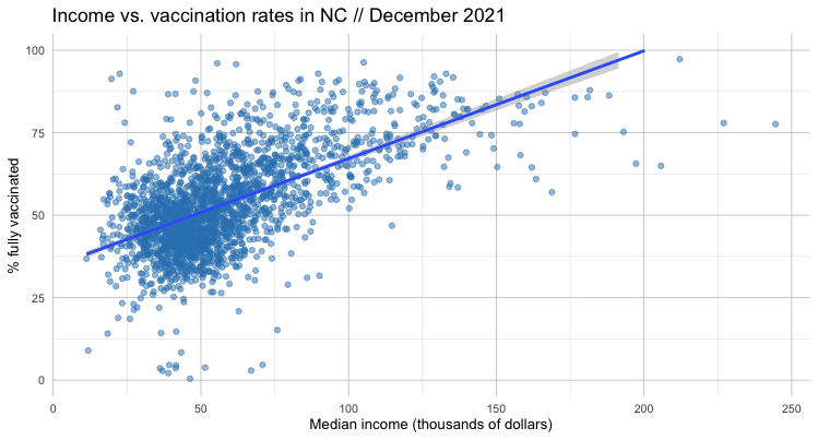
It’s a bit outside the scope of this lesson to dig into the nitty gritty of linear regression. But there are some “spider senses” we can develop to think critically about what the data is – and isn’t – telling us.
We can certainly see that our linear regression line is pointing up, indicating a positive relationship between income and vaccination rate.
But just how positive?
Let’s look at the formula that describes that line – the linear regression itself (don’t forget to keep our units in thousands of dollars).
#adjust our scientific notation
options(scipen = 3)

#see a simplified version of the linear regression formula
vax_main %>%
  mutate(income_adjust = median_hh_income/1000) %>% #adjust our income closer to whole numbers
  lm(formula = pct_vax5up ~ income_adjust)

#see our linear regression formula in more detail
vax_main %>%
  mutate(income_adjust = median_hh_income/1000) %>%
  lm(formula = pct_vax5up ~ income_adjust) %>%
  summary()
There’s a lot going on here, but pay particular attention to the coefficients section.
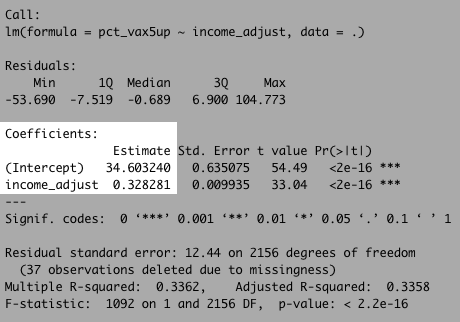
What this is telling us is that our formula (remember y = b + mx from algebra?) can be described by the equation:
#our linear regression formula
vax_rate = 34.6 + 0.328 * income_adjust
We can also look to the R-squared value to – at least as a high a level – how strong the relationship between these variables are on a scale of 0 to 1.
Our R-squared value here is about 0.34. That’s not horrible, but it tells us there’s quite a bit of variation in the model.
In other words: Income is far from a perfect predictor of the vaccination rate. But it’s not totally useless either!
Examining multiple variables
So far, we’ve looked at the relationship between two variables: vaccination rates and income.
But the reality is that the there a lot more going on here than a single measure can describe.
It’s entirely possible to conduct a multivariate regression analysis with the data we have. That can be tough to translate for a general audience – just think about explaining how to extend a two-dimension chart to three (or more) dimensions!
But we can do some limited work to understand these interactions across variables using small multiples.
Let’s try adding a facet_wrap() to our plot, dividing up our census tracts by one of three designations: rural, urban and suburban.
#add a geofacet to the mix based on another variable
vax_main %>%
  filter(!is.na(ruca_class)) %>% #take out any null columns in our ruca class
  ggplot(aes(x = median_hh_income/1000,
             y = pct_vax5up)
  ) +
  geom_point(
    color = '#3182bd',
    alpha = 0.5
  ) +
  facet_wrap(~ruca_class, ncol=1) + #add a facet across another variable in a single column
  theme_minimal() +
  ylim(0, 100) +
  ggtitle('Income vs. vaccination rates in NC // December 2021') + #add a title
  theme(strip.text.x = element_text(size = 10),
        axis.text = element_text(size = 8),
        axis.title = element_text(size = 10),
        panel.grid.major.x = element_line( color="grey", size = 0.25 ),
        panel.grid.major.y = element_line( color="grey", size = 0.25 )
  ) +
  xlab('Median income (thousands of dollars)') +
  ylab('% fully vaccinated') +
  geom_smooth(method = "lm", formula = y ~ x)
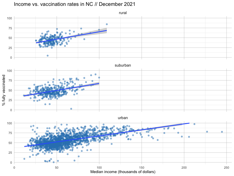
We can also investigate the linear models for each of these subdivided categories by tweaking our code to filter just for the ruca_class we’re interested in examining.
#see our linear regression formula in more detail for rural
vax_main %>%
  filter(ruca_class == 'rural') %>% #calculate for rural only
  mutate(income_adjust = median_hh_income/1000) %>%
  lm(formula = pct_vax5up ~ income_adjust) %>%
  summary()
What do you notice about how these regional designations change the predictive power of income vs. vaccination rates? Is the relationship stronger, or weaker?
Wrapping up
There’s a lot more to explore here visually, but there’s also something to be said about being able to put what we find in plain language.
Quite often, hours and hours of data acquisition, cleaning and analysis go into writing just one sentence (or several) that can form the central kernel of your story.
Consider, the following paragraph in this 2015 story from The New York Times about the families funding the 2016 election:
The 158 families each contributed $250,000 or more in the campaign through June 30, according to the most recent available Federal Election Commission filings and other data, while an additional 200 families gave more than $100,000. Together, the two groups contributed well over half the money in the presidential election – the vast majority of it supporting Republicans.
Given what we know already, what sentences can we write about the relationship between income and vaccination rates?
Let’s consider our regression formula again.
#our linear regression formula
vax_rate = 34.6 + 0.328 * income_adjust
Here’s our discrete question: How much of an increase in household income does it take to raise the vaccination rate by one point?
To answer our question, we can just do some algebra – specifically with the slope
vax_rate = 0.328 * income_adjust
1 = 0.328 * income_adjust
1 / 0.328 = income_adjust
3.049 = income_adjust
Don’t forget that our units are in thousands of dollars (and it makes sense to do some rounding), so our finding becomes:
- On average, our analysis shows, for every additional $3,000 in typical household income, the COVID vaccination rate of a neighborhood increases by about a percentage point.
Try your hand at answering the following questions with some of the tools you’ve learned so far:
- How many tracts are mostly vaccinated?
- What percentage of the population lives in mostly vaccinated tracts?
- How do those percentages compare across urban/rural areas? Heavily Democratic or Republican ones?
What other questions can we answer?